
In October 2004, the Escondido Arts Partnership requested artists to submit proposals for "Doors Into 2005," an exhibit of 6 full-size doors reflecting, in whatever way the artists chose, the theme of entering a new year. The exhibit is being held in conjunction with the annual juried show "Summation, " and the doors were unveiled at the opening on December 11. The public was urged to submit bids to purchase the individual doors, and at Escondido First Night, on New Year's Eve, each door will be auctioned off. The money raised will go to charity. |
||||
|---|---|---|---|---|
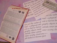
I wrote a proposal saying that I would calligraph quotes about the definition and philosophy of "doors." My proposal was one of the ones accepted, along with a collaborative proposal by a group of calligraphers, all friends of mine and members of the San Diego Fellow Calligraphers. |
 |
|||
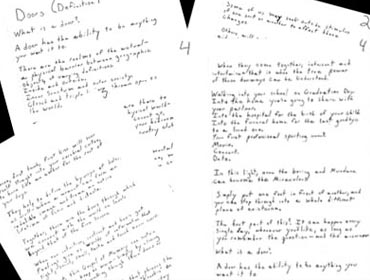
My son Steve, who is a writer living in South Carolina, has expressed interest over the years in our doing an art collaboration of some kind. When I mentioned the "door" project, he suggested he write a piece that I could use on the door. I agreed. Timetables and deadlines are not regarded kindly by either of us, so I continued on independently with my search for “door” quotations and material. |
||||
| I had asked Steve to send me one of the postcards I had given to him and his brother Gregory after I had toured the Rosa Parks Museum in Montgomery, Alabama. When he sent it, I was delighted to also get his handwritten essay on “Doors.” So much of what he wrote resonated with me, and I was delighted to “change horses in midstream,” and make his words the focus of my art. | ||||
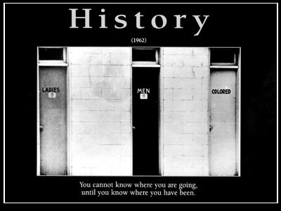
I had already determined that
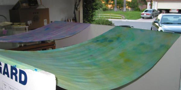
I would work on two large pieces of material, for the front and back (of course the door had to be two-sided! That's one
of the things that makes it a door!). The material needed to be prepared so it would be relatively easy to letter on. Of
course, because I needed to dry the two large pieces in a hurry, the southern California sun deserted me, and I had to park
my car in the rain so I could use the garage as my drying room. |
||
 |
||
|---|---|---|
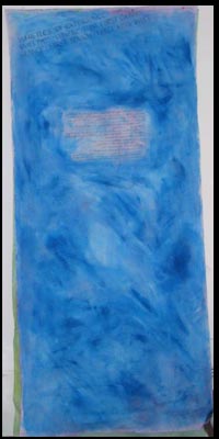 |
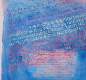
For some reason, I had decided to work on the back of the door first. (Remember this - it will come back to haunt me!) Steve and I had spoken of beginning the piece with the dictionary definition. I wasn’t sure what particular calligraphic hand I wanted to use, particularly as the deadline was fast approaching, and there were a lot of words to write!I used a mirror-image laser print of the dictionary definition of "door" – of course it was reversed, it was on the back of the door! As I began to letter, I had difficulty working on the rough surface. I experimented with a variety of diferent fonts, finally choosing a monoling Roman Capital, because the B-nib moved more easily over the surface. | |
|---|---|---|
 |
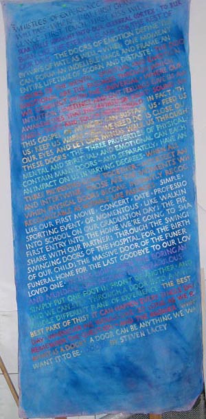 |
<<<<<<<This is the back door almost finished -I think. I have completed the text from the place I arbitrarily decided was the middle of the composition. All I now have to do is re-letter the top portion so the fonts match. Several years ago I learned that Simple Green removes even acrylic paint from canvas.
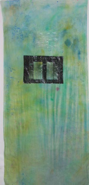
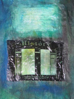
>>>>>>>>> This is the start of the front door, with the transfers of the dictionary definition of "door" and the "History" postcard. Steve and I had talked about using a different color acrylic ink for each paragraph, since stacking the lines did not allow for indents. It became clear the background was too light to set off the colors that had been used on the back. |
 |
 |
 |
Not only did I darken the background, I also added acrylic medium to the wash, so that when it dried, it was a much smoother surface on which to letter. I could tell that I could use a broad-edged nib with no difficulty, and so decided to use a serif alphabet for the text. Because I wanted to "bounce" the lines, I chose to letter horizontally rather than on a slant. Front doors and back doors are not always the same, and I wanted the front door to be more formal than the back because of the message of the "History" postcard. |
|---|---|---|
 |
||
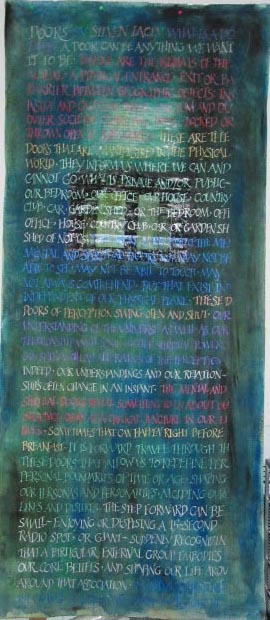
| Below: On the left is the finished
material for the front door. From the bottom of
the front painting (on the lower left) to the beginning of the text on the back material, there are three missing paragraphs!
##^$%#$*^%&&)*)*&%*^^$#^()^&$^*$%^&$ So much for being in a hurry and not planning ahead! |
||
 |
||
|---|---|---|
| This is a closeup of the writing over the postcard transfer. | ||
|
||
This is a closer-up of the writing superimposed over the transfer. |
||
|
||
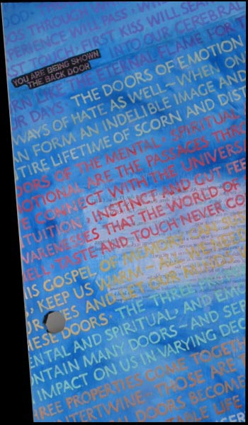
| The words on the black background, to the left, were embroidered on a separate piece of material and sewn to the back door material in a space deliberately left to accomodate them as I added material to incorporate the three missing paragraphs. The connecting seam is below those words. | |||
 |
|
||
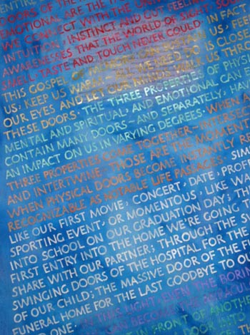
| In the closeup below, the lavender lines at the very bottom conceal the line of stitching where additional material was added to makeup for the material I chopped off (at 12:30a.m.!), thinking I had the solution to the missing paragraphs. After midnight, I'm usually wrong! | |||
|
|||
 |
|||
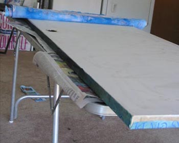
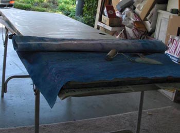
| When all the lettering was complete, and all the seams were sewn, it was time to attach the material to the actual door. Back to the garage. It was once again raining, but I need a well-ventilated space to use spray adhesive. I set the table on a folding table and rolled the lettered material down as I used a brayer to remove air pockets. | ||
|---|---|---|
 |
||
| After pasting the front door material down, and using ATG tape on the sides
and bottom to keep the material taut, it was time to fasten the second side. There was less margin for error in pasting, since
this material would wrap -and be seen!- covering both sides. |
||
 |
 |
|
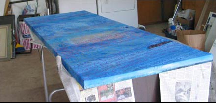
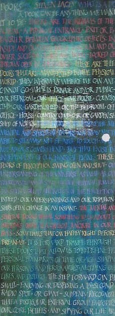
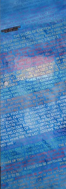
| And it was done! All that remained was trimming the sides and gluing the material through the door-knob-hole. | ||
 |
||
 |
 |
|---|
The pictures below were taken at the Doors into 2005 Exhibit, at the reception
and the following day. |
||||||
|
||||||
| For more photos from the reception, click here. |
|---|
 |
|
|---|---|